Animal shelters need volunteers to operate, however the majority leave within their first few months.
What contributes to that and what can an organization do to retain volunteers?


PLACEHOLDER
1. OVERVIEW
4 Weeks
Company
Time
Tools
SFSPCA
4 Months
Team
• Figma
• Miro
• Photoshop
Solo UI/UX researcher and designer
My Responsibilities
• Conduct research to find potential causes and pain points
• Informational architect for a resource app
• Ideate and create working prototype
• Conduct usability-testing and iterate
• Present findings
PROBLEM
80%
of new volunteers
stop showing up
-Volunteer Coordinator
I started volunteering at the SFSPCA and was talking to the volunteer coordinator about some of the difficulties they’ve had retaining volunteers. Surprisingly, after two months, 80% of new volunteers stop showing up. However, volunteers who stayed longer than six months tended to stay for years.
The volunteer coordinator welcomed me to investigate the matter and see if they can do anything to improve retention. The problems are:
-
Discover what pain points volunteers are having.
-
Investigate why volunteers no longer feel connected to the animal shelter.
-
Suggest what support they could offer.
SOLUTIONS
Get volunteers comfortable reaching out to mentors
While there is a system for mentors or "Buddies," it is not utilized by beginner volunteers. Get new volunteers used to reaching out to mentors by involving mentors into training.
Create a resource app
There is an overwhelming amount of information for volunteers to keep track of. By having everything available in a mobile app that they can search through, it'll cut down on information overload.
Show the impact volunteers have
Acknowledge positive results from their volunteering by notifying them when dogs they helped get adopted. This reinforces that their efforts have an impact.
Make guides for new volunteers
The first shift is always hardest for beginners because they must remember and apply their training. Creating an online guide helps give them a set of protocols they can follow, should they not remember what to do.
2. DISCOVER
VOLUNTEER COORDINATOR INTERVIEW
I first interviewed the Volunteer Coordinator to learn about their difficulties and what they’ve tried. Due to COVID, they had to stop using volunteers for over a year, which decimated their volunteer pool.

Since the SFSPCA is the largest animal shelter in San Francisco, outreach has never been an issue.
But because so many volunteers stop coming, they need to constantly onboard new volunteers.
New volunteers getting trained
COMPETITIVE ANALYSIS
Retaining volunteers is a common problem that any organization that relies on volunteers encounters. I researched ways different non-profits engaged their help.
Key to Retaining Volunteers

Empower your volunteers by properly training them.
Provide resources to support them if they need help.
Show appreciation to your volunteers and acknowledge how valuable they are.
USER RESEARCH

I conducted five user research interviews after putting a screener on the SFSPCA Dog Volunteer Facebook group, primarily targeting volunteers with less than 6 months of experience. I selected men and women of various ages, since our volunteers span 20s to 80s.
However, this targets active volunteers who likely feel more attached than those who stopped volunteering.
Interviews were about 30 min and covered these topics:
-
Discovery
-
How did they find out about volunteering at the SFSPCA?
-
How long have they been volunteering?
-
What was their comfort level with dogs beforehand?
Training
-
What was their training like?
-
Was the class a good size?
-
Did they have enough time handling dogs?
-
Are there topics they wished were included in the training?
First Shifts
-
Did they feel properly trained for their first shifts?
-
Were there any surprises and if so, how did they deal with it?
-
What could've made their first day easier?
Impressions
-
What is your general impression of volunteering?
-
Any pain points when it comes to volunteering?
-
What do you think of the SFSPCA community?
-
Do might cause you to stop volunteering?

Volunteer experience level is represented by the color of their aprons. Tan aprons are beginners, blue aprons are intermediate, and red aprons are advanced.
PAIN POINTS
There were common themes that came up with interview subjects involving pain points:
-
Everyone got physically lost on their first shift. This is due to the campus being incredibly confusing.
-
Many thought having a mentor would've helped but didn't want to ask for one.
-
They felt overwhelmed by having to remember all the protocols.
3. DEFINE
AFFINITY MAP
From the interviews, I categorized these into four aspects: “Background,” “Recruiting,” “Training,” and “Volunteer Experience.”

Each color corresponds to a different interview subject
EMPATHY MAP
I then summarized what a new volunteer might think, feel, and experience as they’re starting out.

Empathy map showing what volunteers experience
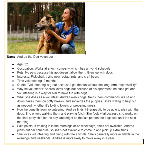
PERSONAS
From these maps, I made these two personas for this project. The first one focused on a younger volunteer who joined because she wanted to be part of a community. The other is based on a retiree who volunteers to get out of the house and contribute.
Initially, I focused more on the younger persona because my thought was they were more likely to stop volunteering, so we should work harder to retain them. However after testing, I realized that accessibility was important due to the number of elderly volunteers. I'll talk more about that later.
PLACEHOLDER
HOW MIGHT WE...
Using these interviews and research, I made How Might We questions to summarize the three most important issues to address these problems:
-
How might we better train volunteers to be more comfortable handling dogs?
-
How might we better prepare them for their first shift?
-
How might we show the impact of their work?
SOLUTIONS
From these considerations, I arrived at these solutions:
-
Incorporate the Buddy System into training. There is a mentorship program where people can reach out to Buddies to shadow them on their first shift, however, this is underutilized and not many volunteers reach out. By involving Buddies into training, it makes volunteers more comfortable in reaching out for support.
-
Alert volunteers when a dog they visited gets adopted. This allows them to see their impact when they see that a dog they interacted with, has found a home. This also acknowledges and appreciates their work.
-
Create a mobile resource app. Since volunteers can feel overwhelmed by all the information presented to them, having an app would empower them to find information when needed. This is what I’ll continue building on as a spec project.


Examples of some of the information available for volunteers
4. IDEATE
MINIMUM VIABLE PRODUCT (MVP)
For the MVP, I wanted to concentrate on having a Walkthrough Guide, and access to important information a volunteer would need, especially if they’re new. This would include maps, videos, door codes, and a way to call the volunteer hotline.
SITEMAP
I made a sitemap considering what key features would be useful from user research and my own experiences as a volunteer.

This was the initial sitemap. There were lots of changes after usability testing.
USER-FLOWS
With the constant flow of volunteers, the protocols are very linear. This was useful to me, since that makes a guide easier to follow.

NOT MAGNIFIYING
This shows the tasks that a dog volunteer has to go through during a shift.
5. PROTOTYPE
SKETCHING
I made my sketches with these things in mind:
-
Bottom bar navigation for features that would be most needed. It evolved from just a button to call the volunteer hotline to including other important features like videos and maps.
-
Accessible to use with one hand. If you’re carrying a leash, you might not have two hands-free
-
No account is needed for now. For the MVP, this is primarily a resource app and I didn't want to lose people by having them create an account. In the future, accounts might be incorporated when there is a reason for it


The Walkthrough Guide evolved from having one big scrolling page to a multi-page guide, similar to an onboarding flow, because it would be easier to separate into sections.
The bottom bar evolved from one button to contact the Volunteer Hotline to include other vital buttons.
WIREFRAMING
Guides evolved from a multipage onboarding flow to an accordion menu. I wanted it to be more searchable by arranging all the information into sections.

Using accordion menus made things more organized but brought problems. More later.
STYLE GUIDE

The style guide evolved with testing. Originally, it used more colors to match their website which uses bands of different colors. In practice, for an app, it was distracting to constantly see different colors.
Also, following their website, they had pictures of dogs everywhere. I found this to also be distracting, so I removed those images in favor of simple icons everywhere.
HIGH-FIDELITY PROTOTYPES


v1
The hi-fi prototypes evolved from v1 to v2 to create a more defined hierarchy. By incorporating the colors of the logo into the design, it created consistency for the brand. The text was easier to read, and it was visually more apparent that the buttons were buttons.
Guides changed between versions quite a bit regarding accessibility. I'll talk more in detail about that later
v2


v1
v2
6. TESTING
USABILITY-TESTING
I conducted four moderated usability tests by walking around the shelter seeking newer volunteers in tan aprons. Tests took 20-30min.
TASKS
With our MVP and goals in mind, we had the following tasks for users:
-
It's your first day. You took the training a month ago. You're not sure what the protocol is. How do you get through your shift? (Guides)
-
Try to locate where you are and how to get to the kitchen and playground. (Maps or Guides)
-
You're having trouble leashing a dog. How would you find information to help? (Videos or Guides)
-
You're returning from the playground to the kennel with a dog. Another volunteer with a dog is in front of you so you can't return the same way. How would you return the dog to its kennel? (Maps + Door Codes)
After they were done with the tasks, I had them freely use the app to get their impressions and see if there were any sections or features that they thought could be useful.
RESULTS
Users were able to complete most of the tasks, but it took a lot of seeking to find some answers.

Here are more findings from the usability tests:
-
Elderly users who were not tech-savvy had trouble navigating the accordion menus and identifying buttons. They also had issues reading smaller text.
-
Bottom bar navigation was overlooked. Important pages were not spotted immediately, which was the intention of having them on the bottom bar.
-
There were some sections that users thought were not as useful, and a few suggestions on what they did want included, like a FAQ and Fecal Chart.
-
People preferred seeing photos of resources as opposed to rewritten text due to familiarity.
-
Once users understood how the app worked, they really liked it and wished it was around when they first started.
SOLUTIONS
Here are suggestions to issues that came up:
-
Redo the accordion menu with bigger, labeled buttons.
-
Take videos off the bottom bar because users didn’t think it was as important and overlooked.
-
Navigation updates (logo should take to home screen) and bigger text for legibility.
ITERATE
One of the biggest changes was realizing that accessibility was a crucial issue to consider due to the number of elderly volunteers. They make great volunteers because they’re less likely to move away and more likely to be around long-term.
This caused me to rethink my primary persona. My original persona was younger because they were more likely to stop volunteering. However, if the organization and navigation were clear and easier to use, the app would still benefit younger users while being more accessible to elderly users.

PLACEHOLDER
Changing primary persona to focus on an elderly volunteer

For assets around campus, people preferred the look of that out of familiarity, so instead of text, I swapped it with photos.
The last major change is the initial look of the Guides section. The collapse and expand buttons are bigger, more visible, and labeled. The first entry was expanded to show how it works.

RETEST & RESULTS
I retested using another four subjects, making sure at least two were elderly.
Some of the key findings:
-
While non-techy savvy users could figure out how the accordion menu worked, it wasn't intuitive and they didn’t realize to scroll down to see the other sections.
-
Moving Videos off the bottom bar made it easier for users to find them as a button. Users associated the bottom bar with navigation instead of a specific page. Maps were difficult to find also because they didn’t look on the bottom bar initially, despite it being persistent
-
There was confusion about what section the user was in, and users wanted an easier way to find more important pages.
Suggestions:
-
Start with all sections in Guides collapsed.
-
Move Maps off the bottom bar and onto the home screen.
-
Add Saved to the bottom bar, with important pages saved by default.
-
Add a way for people to Save/Unsave pages.
-
Use breadcrumbs instead of subheaders.

v2 with subheader, expanded accordion,
Maps in lower bar, no Saves

v3 with (left) Maps moved to homepage, Saved in bottom bar, Saved Icons on buttons to show saved sections,
(right) Breadcrumbs, Saved button in top-right, and collapsed accordion
FUTURE
Think ahead, there is plenty that could be done to make it more useful for staff and volunteers.
-
Apply better functionality by linking the Calendar so it can be digitally edited and synced with the user's calendar. Integrate a way to sign-up for classes from the Calendar and get reminders of shifts and events.
-
Become a hub. There are four different logins (signing in, changing your shift, signing up for classes, and checking out dogs) so that users can use the app as a hub instead of going to 4 different pages.
-
Push notifications when a dog they visited gets adopted. This reminds volunteers of their contributions helping.
7. CONCLUSION
OVERALL
IMPRESSIONS
As my first project, I learned a lot through the design process. Being able to put my learnings to work was a great experience, especially for a cause that I care about.
I realized that I love doing usability tests. Observing and asking questions about a user’s thought process was fascinating and made me consider things I didn’t think about. Thinking of solutions and iterating was a fun puzzle to solve.
Everyone that I interviewed was friendly and wanted to help. They appreciated my trying to help the cause and knew my intentions.
DIFFICULTIES & LEARNINGS
One key thing I learned from this project was to focus on accessibility by elderly, less technically inclined users. This includes having bigger font sizes, contrasting colors, and large, clearly labeled buttons.
More tech-savvy users are interested in quickly accessing the resources they want. Navigation and being able to identify what section they are in is important.
Last big finding was that users tend to not notice the headers and bottom bars in the hierarchy because they grow accustomed to it since they’re mostly static. Visually, they look towards the body of a page first when searching for a section.
For more information, check out my About Me, connect with me on LinkedIn, or
contact me at courtneysid@gmail.com